XM360 Customer service platform
Year: 2017-2019
Team: 3 UX designers and a dedicated engineering team
My role: Senior Designer (in-house)
In the beginning
Xfinity Mobile started with a bootstrap mindset, but the offering’s success quickly outpaced the lightweight tools we had in place to support it. While network techs could tackle complex issues using dedicated tools, most customer needs (things like billing questions, account management, and device activations) fell to Tier 1 agents without the same level of technical expertise. As the user base grew, support teams were inundated, relying on a hastily built set of ZenDesk flows that amounted to a static list of agent actions. Unsurprisingly, this arrangement wasn’t scalable, and a new approach was needed.


Laying the groundwork for a platform
My team was tasked with designing a new tool from the ground up to support all Tier 1 care and device sales for Xfinity Mobile. The challenge? A tight deadline and a dev team already standing by for designs before we’d even kicked off. We structured the information architecture around insights from card sort exercises with Tier 1 agents, grounding the top-level navigation in how they naturally think about customer needs. From there, we mapped our MVE jobs-to-be-done to that framework and got to work on flows, wires, and UI concepts to flesh out our platform.


Iterating our way to a System
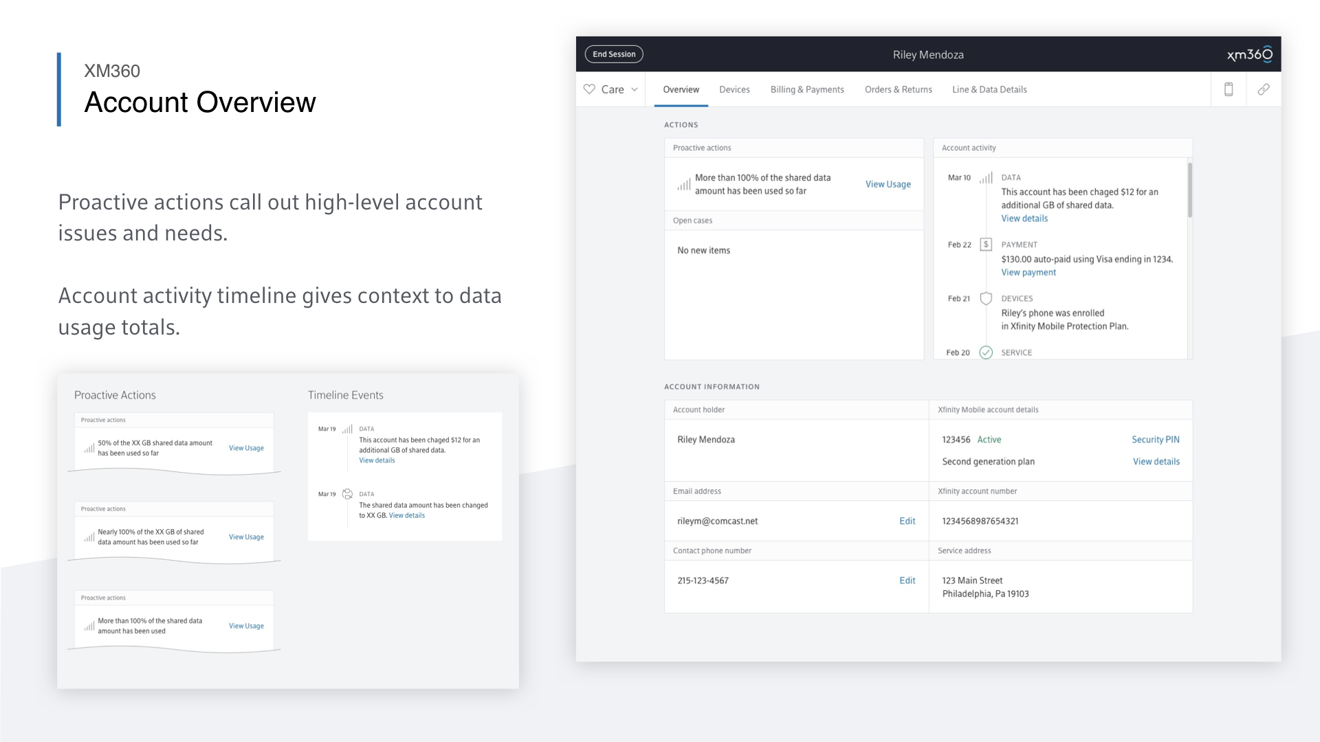
XM360’s design and functionality grew organically. We started with simple designs, and our shared design system became more cohesive as the design team worked through core functionality. We worked in parallel across different parts of the application, holding regular check-ins to align on a shared set of components and UI behavior.
We collaborated closely with our engineering team to ensure that our design decisions didn’t conflict with the technical constraints of the numerous backend systems we were integrating with. Most importantly, we kept our end-users in the loop through workshops, site visits, and informal remote design reviews with Tier 1 agents. This process built a strong relationship with our care partners that proved hugely helpful over the years.
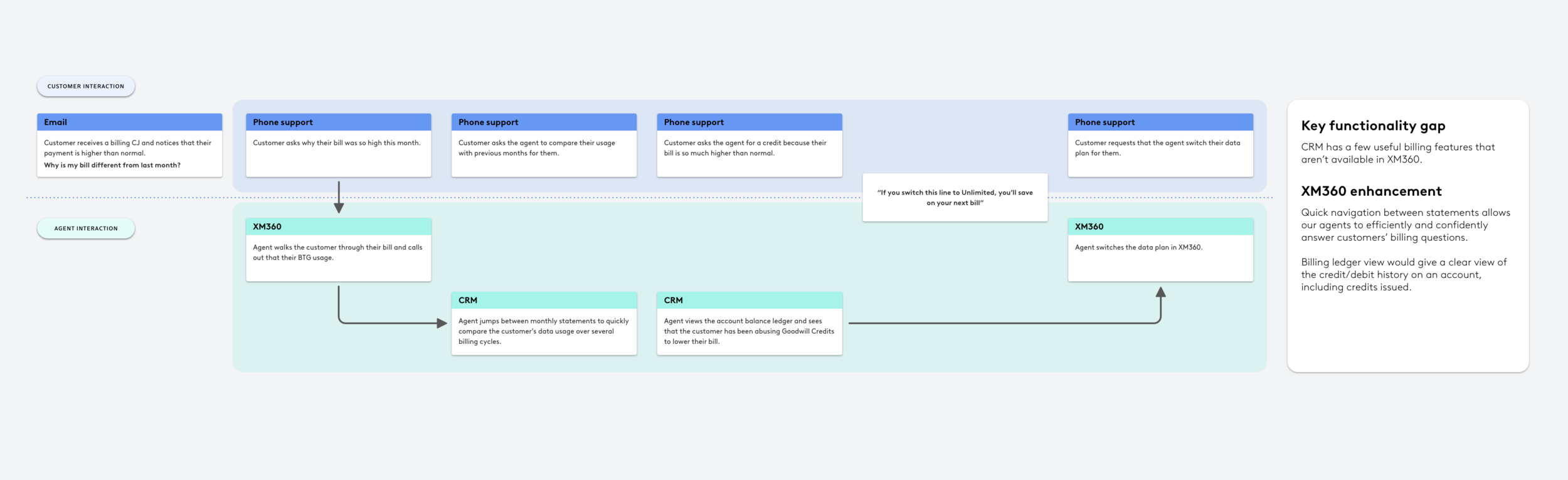
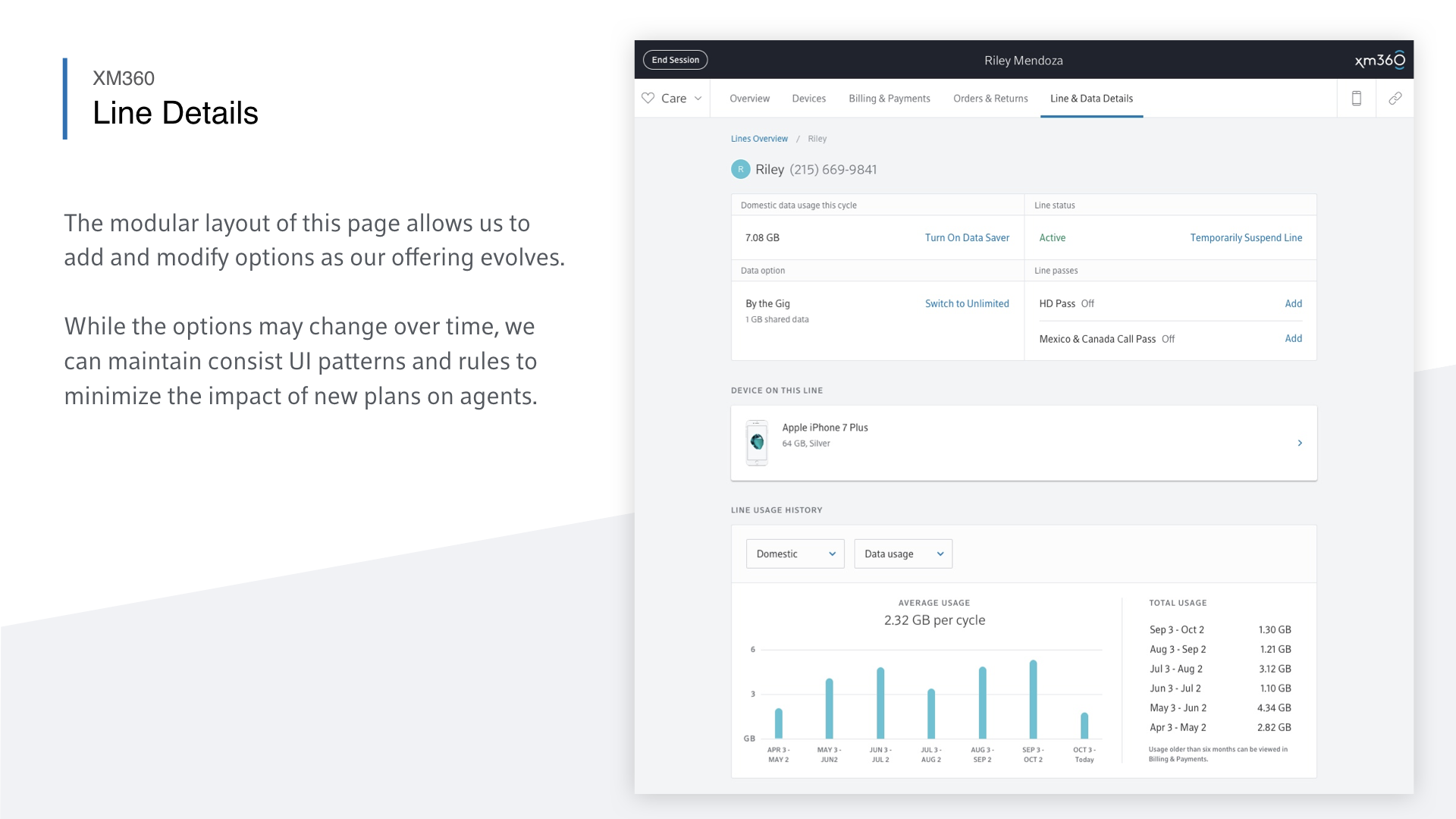
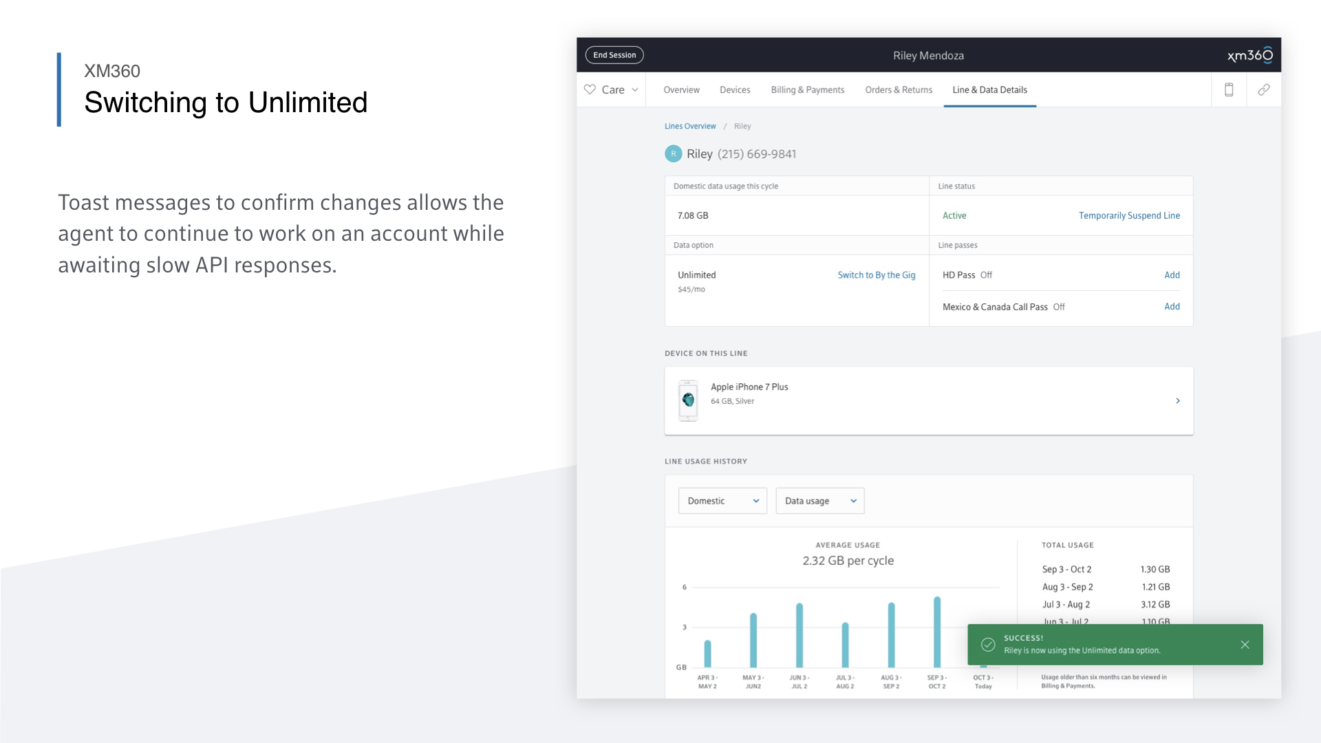
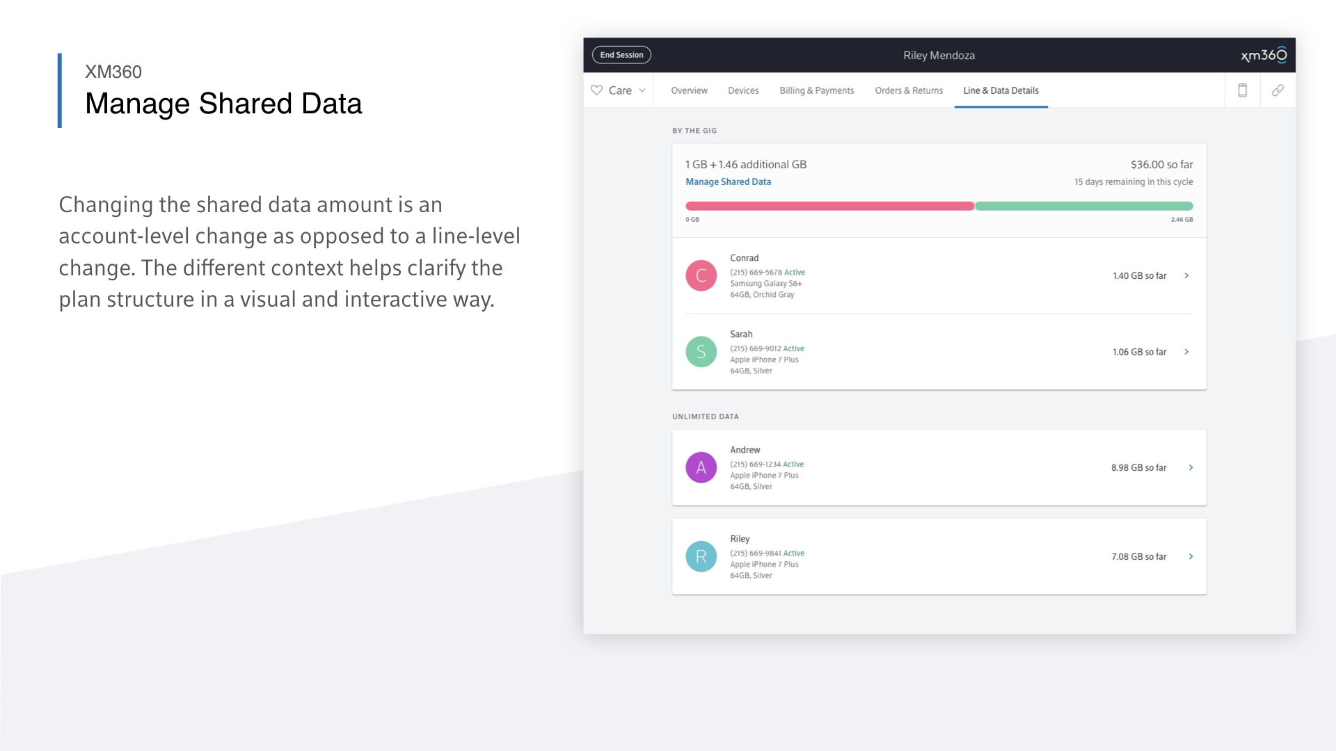
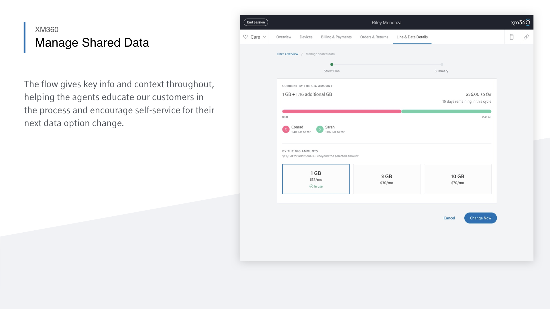
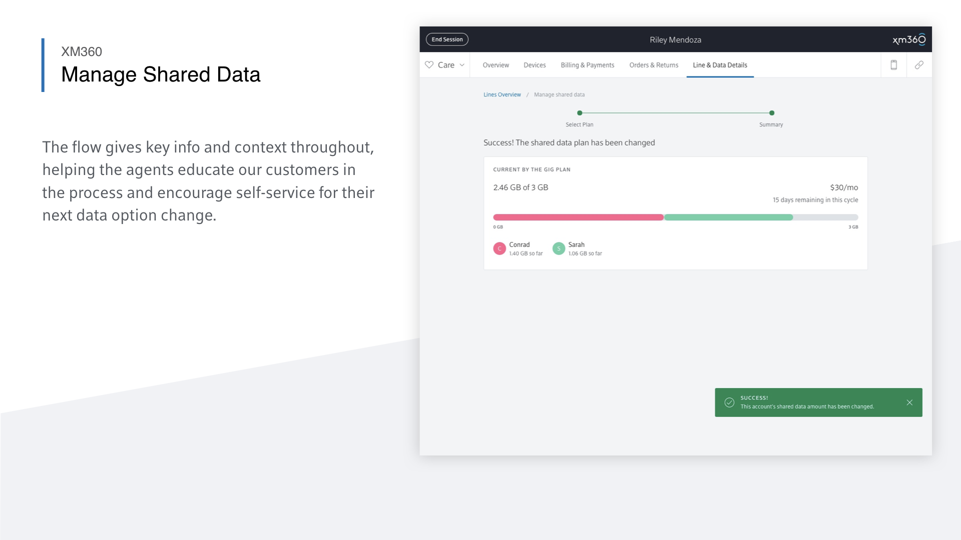
In addition to incrementally improving existing functionality, we also needed to update our platform as the Xfinity Mobile offering evolved. The slides below show the broker interface for Xfinity Mobile’s new shared data and Unlimited data plan options. Our data plan switching interface is uniquely tailored to the experience of walking a customer through their data usage habits to help them select the ideal plan option.


Collaboration & Inclusive design
A key to the success of XM360 was the effort we put into bringing product, developers, and our end users together. Below are some examples of the collaborative processes employed to ensure that all voices were heard, from product, design, development, and end users.


A living platform
Our work on XM360 didn’t stop at launch. We continued refining the tool to meet the evolving needs of the business. Each new feature or UI update began with an in-depth impact assessment and early concepts to align engineering, business, and care stakeholders before anything moved into development.
Alongside roadmap planning, we kept listening. We gathered ongoing feedback directly from Tier 1 agents to better understand their day-to-day needs. The gallery below shows some of the artifacts we created to share research insights and build alignment around future improvements.