
Amex Points Promotion Manager
Year: 2016
Client: American Express
My role: UX Designer (consultant)
Project Background
Credit card companies are in an all-out arms race to attract premium customers, and rewards programs are the battleground. The Membership Rewards group at American Express brought in my team to help them stay on top of the premium credit card world. They had high hopes for inspiring program engagement through targeting key users with promotions (for example, offering a 20% discount on using rewards points towards flights on a particular airline), but their internal systems for setting up points promotions and special offers were painfully outdated. Few of their marketing team members even knew how to set up and launch a promotion, and they were limited to simplistic targeting and timing to entice key customers to spend their rewards points.
The project began with a deep-dive into Amex’s existing systems and processes, which involved navigating a byzantine web of outdated tools. Field names weren't consistent across the different campaign setup tools, repetitive manual data entry was the norm, and a 'chuck it over the fence' mentality with the campaign setup process meant that no one person had an end-to-end view of what went into setting up a campaign.
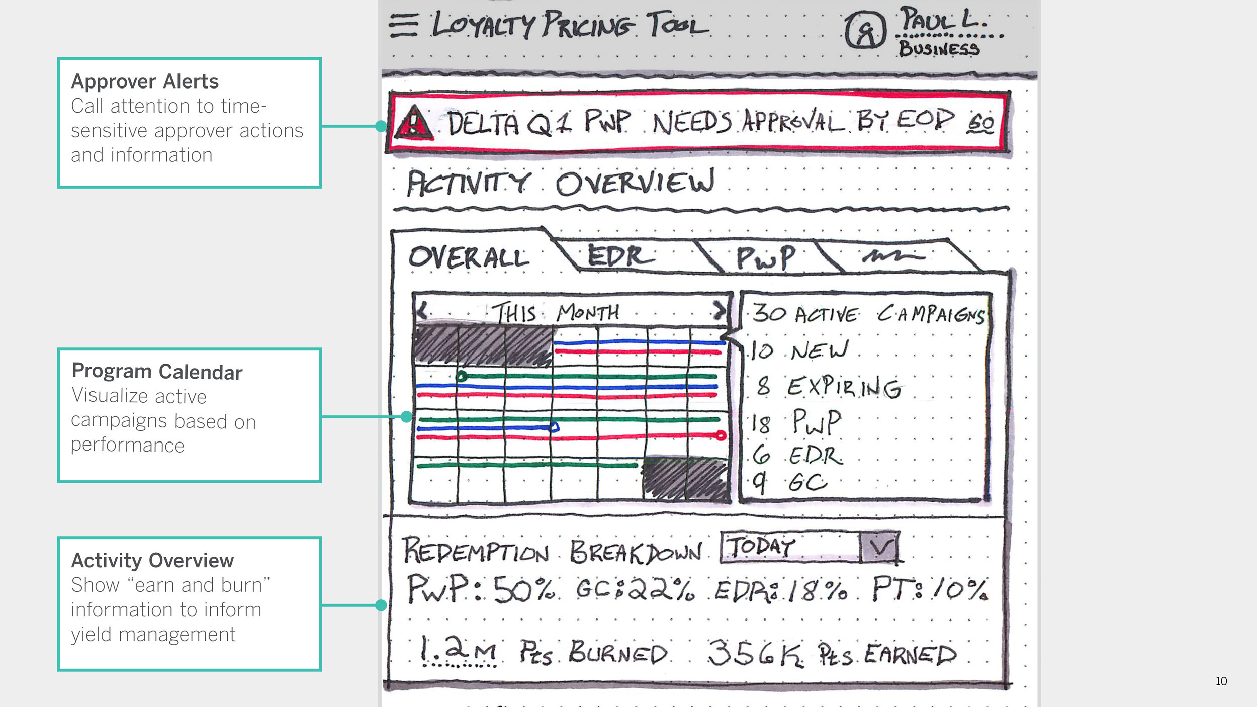
The slides below come from the conclusion of our extensive research phase, in which we spoke with end users as well as the developers who maintained the various backend systems, with the ultimate goal of building a cohesive model of the rewards program promotion setup process. The goal of these interviews was twofold - first, to understand their role in the campaign setup process and the tools they used to achieve it, and second, to identify their pain points.


Problem Framing
Our holistic understanding of the campaign setup process built trust with both the marketing team as well as the development team, and the problems we identified laid bare the weakness of the current system (as well as the great upside to improving it).
With this understanding of the campaign setup process in mind, we created sketch concepts for validation with the client team as well as the future users of the tool. After several rounds of workshops and prioritization sessions, we took our key recommendations from the research phase and embodied them in several tool concepts.


From Vision to MVP
Our concept presentation gave us a clear idea for where the client would like the tool to be in the future, but overhauling the entire system all at once was not a practical solution. As a result, we designed a UI framework that could seamlessly incorporate new capabilities as they were built out. We worked with the internal tech team to design an MVP that was built within months, yet was future-proofed to allow the client to fold more functionality into the tool as time went on.
The Overarching Structure
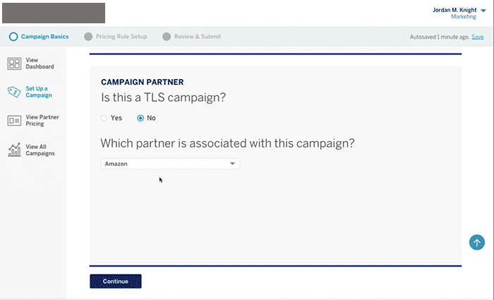
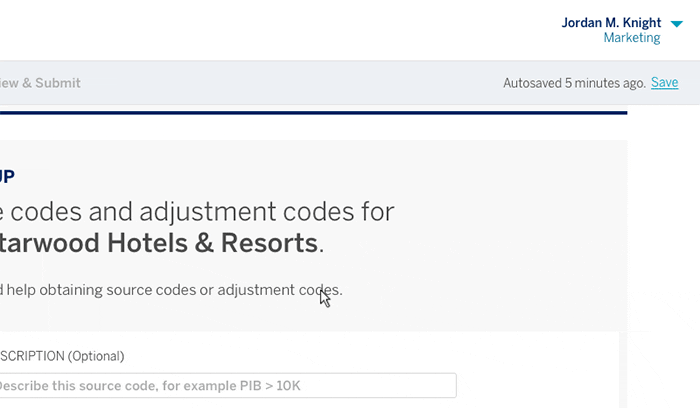
The original campaign setup process was made up of a myriad of disjointed forms to be filled out and submitted in various tools. Some of these forms were long and required input from several people. In order to adapt the tool to the ideal workflow, we created a card-based flow that broke the massive forms and submissions down into manageable chunks. These 'setup cards' are navigated either by scrolling or using the buttons to jump between cards and sections. A dashboard and section-navigation structure allowed a user to gain a holistic view of the tasks they needed to complete to set up a campaign, and integrating their tasks under one interface ensured that key fields weren't being missed or filled out incorrectly. A content overhaul also helped minimize confusion by aligning all users around a common set of field names and options for parameters. The gifs below are part of our delivery to the tech team that was to build the final system, along with full spec documents and clickthroughs, an example of which is linked here.

Delivery and Design
The creation of a viable design system is never easy, and our designs were frequently tested with newly uncovered edge cases and tech limitations. Through frequent user feedback sessions and tech team discussions, we were able to hone our final system and ensure that the designs could adapt to whatever the client needed for future campaign ideas.
Training Site Delivery
After the final the developer handoff, we built out a microsite to help users learn the new system. Our training site included a step-by-step walkthrough of a campaign setup to help users better understand their new roles, as well as information to help explain how the tool would make their job easier.

